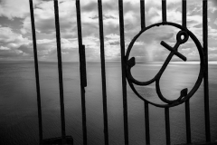
I just received notice that two of my Open Monochrome images were accepted to the NYC Exhibition 2017. I had a total of twelve entries into three of the competition divisions: four in Open Monochrome, four in Photojournalism, and four in Street. The two that were accepted were in Open Monochrome and happened to be the two that were the most heavily edited.
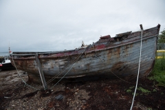
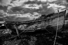
Both images were composites of photographs that I took in Scotland in 2016. The first, Tied Down, I thought interesting because of the lines that tie the boat to some invisible anchors. I wanted the dark shadows and angry sky to threaten the safety of the boat in spite of the lines. Below, the first image is the edited version, the second is the original raw image of the boat, and the third is the sky. Click on any of the images to see more detail.
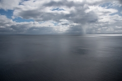
The original image of the boat was not remarkable at all. The colors were flat and the sky was featureless and white. Flat colors almost always suggest black and white to me with some adjustments to exposure and contrast. As for the sky, I found another Scottish seascape that had a fine sky. This gave me a sky with some character and I liked it well enough that I used in several other images. For Tied Down, I converted it to black and white, stretched it a bit to cover the background, and adjusted the contrast to make the sky appear more threatening.
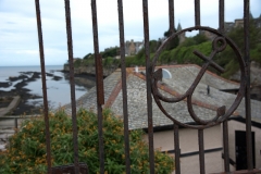
The second accepted image, The Sky, the Sea, used my favorite sky as the star of the image rather than as the background. The seascape itself is boring, but I saw the promise of black and white. A slight, curved gradient helps to focus attention on the horizon rather than the featureless water. The little rain shower at the horizon on the right was perfectly positioned to fit into my anchor at an almost perfect location in the composition. Below, the first image is the final edited version and the second is the source of the wrought iron fence. Click on either to see more detail.
The wrought iron fence came from a Scottish scene that is missing color and impact. I loved the fence and used it to create the foreground layer. I converted it to black and white and adjusted the exposure so that the detailed features of the fence didn’t detract from the background.
The photos were shot using a Nikon D750 with the Nikkor 24-120mm f/4 kit lens. The lens is heavy and slow, but versatile for travel shooting. I don’t like carrying extra lenses with me on vacation. The edits were done with Photoshop CC. I love Photoshop, but there is little that is easy or cookbook about using it. It takes a lot of time and trial-and-error to get a great result. If you are clever, you can avoid the need to start over if you make a mistake during the trial-and-error part.
My first love is street, photojournalism, and candid photography. This kind of editing is not acceptable in those divisions because it materially alters the facts. It has been important for me to leave my sandbox to compete in other open categories because of the ability to experiment and most of the artistic skills transfer.
