My PSA Bronze Portfolio – The Good

Late last year I submitted ten images to be assessed by five Photographic Society of America assessors. The PSA portfolio program provides an opportunity for those of use without a long history of photographic achievement to get recognition for our work. Unlike many competitions, the images that do not make the grade receive critiques. Professional photographers receive regular and significant signs of approval from clients and successful competitions. People like me who have aspirations to be good photographers do not have such great sources of reinforcement in practice. The PSA portfolio program helps to at least partially resolve the difficulty.

There are three levels of portfolio distinctions: Bronze, Silver, and Gold. The Bronze level requires ten images, Silver fifteen, and Gold requires twenty. A photographer can skip levels and go directly to Gold, but that would be foolhardy in my opinion. My quest began with Bronze.

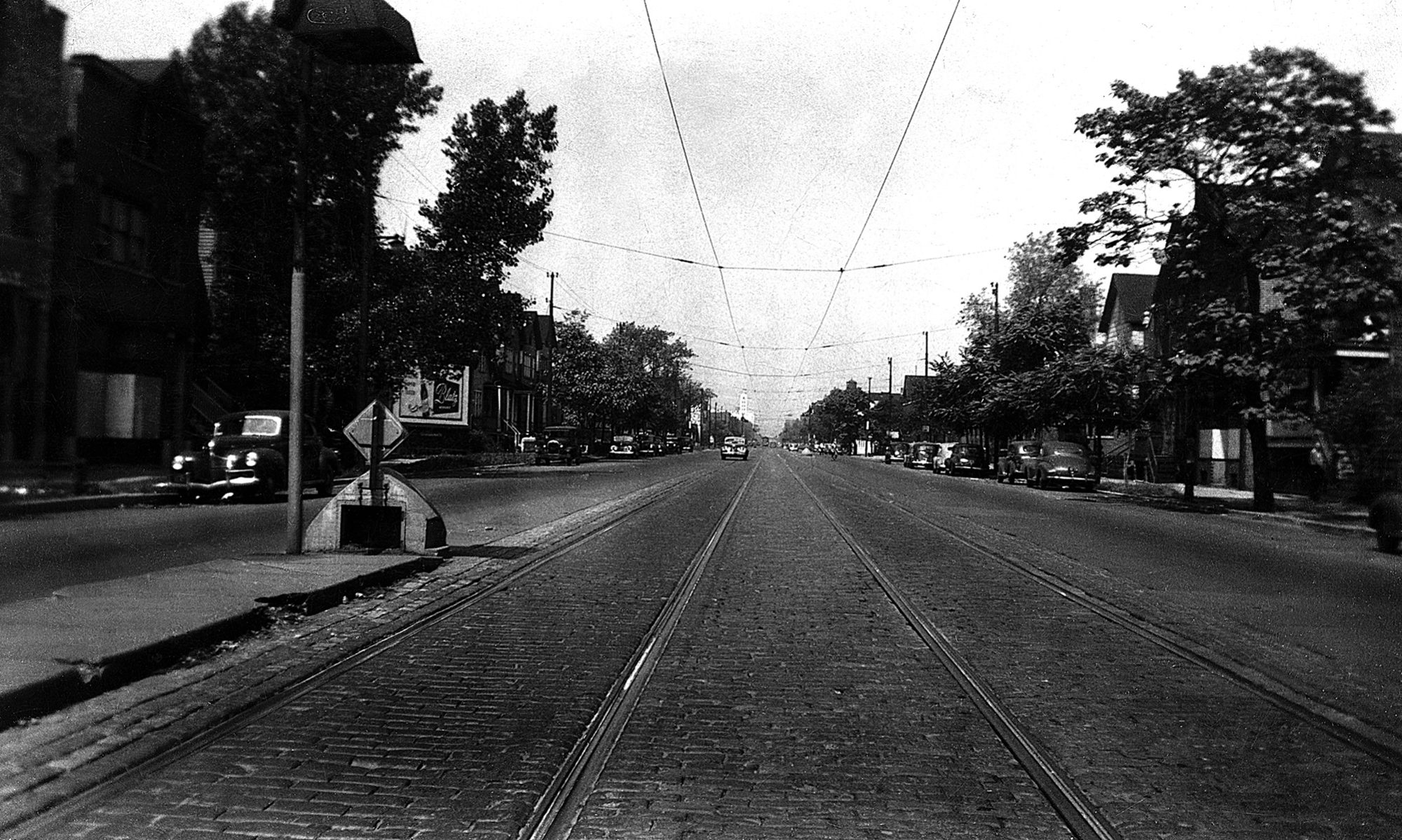
The theme is important since each image must tell the story stated by the theme. My theme was “Boston, You’re My Home”. All of the images are street photos rendered in black and white.

The comments that I received sting a bit. The assessors comments are only provided for the images that did not do well. Of the five assessors, at least four must approve each image to qualify the portfolio for honors. Three out of ten of my images qualified. Let’s look at the ones that qualified.

The first one, “Pride”, was taken at a gay pride event in Boston. The placement of the subjects is great, if I must say so myself. The tones are balanced and the focus is sharp. The sign of Faneuil Hall in the background echos the theme.

Pride

The second image, “Reportage”, was taken at an evening protest near Boston Common. The New England Cable News reporter is in the moment and her placement in the frame is good. I also like that she is facing toward the right. I think that viewers like that since we read from right to left. The right to left movement also takes us to the camera operator. His stance says something about the height of the reporter. The focus on the subject and the camera operator is sharp.

Reportage

Finally, the third image, “Touristic Lecture”, is a common sight in downtown Boston. The actor in period dress is explaining the history of the city. In this case, the subject is detached from the lecture while the actor is in motion and trying his best to make his point. The focus on the subject is sharp and helps to draw attention to her.

Touristic Lecture

I agree that those were the best of the ten. If you have any comments, please feel free to weigh in. I would be interested in knowing your thoughts on these. My subsequent posts will present the not so good.

Lightroom 2018 and the Cloud

I like being able to access files across multiple platforms. The suite of Lightroom CC Classic,Lightroom CC, and Lightroom Mobile provides that for me with my image files.Because of complaints posted online, I waited for some time before upgrading. The new versions caused some confusion because of the names of the applications. The old Lightroom CC became Lightroom CC Classic and in my opinion it remains a strong desktop tool. The new Lightroom CC is cloud-based and it compliments Lightroom CC Classic on the desktop as well as other handheld platforms. Lightroom CC provides the platform independence that I like. If you subscribe to Lightroom CC, you can access your images on handhelds using Lightroom Mobile. More about that in a moment.

People blanch at the cost of the Creative Cloud software since it is now sold as a monthly or annual subscription rather than as a license that you purchase once. As an amateur photographer, I have justified paying for the subscription since my software will never be out of date and I will not need to go through the upgrade machinations every so often. Software is constantly being upgraded to accommodate new hardware, to fix bugs, and to add new features. I want those things and would rather not be bothered with the timing and cost of license upgrades.

Once past the sticker shock, the new Lightroom suite has great potential. Lightroom CC Classic works pretty much like the old Lightroom CC. It has some updated editing features and presets that I like. When installed, it converts your catalog and moves it to a new directory to complete the installation.

Lightroom CC is a different story. It is cloud-based. It has a more streamlined appearance than Classic and less functionality. Lightroom CC allows you to share your images seamlessly among all of your devices from desktop to handheld to smart phone. You have access to your presets and to most editing features across all of the platforms. Many professionals are concerned that the cloud storage is too costly given the sizes of their libraries. I agree, but my approach is to manage the amount of cloud storage that I use.

Between Lightroom CC Classic and Lightroom CC, I use a different workflow. Classic is work station based, which is fine, especially when you are dealing with large libraries. My flow goes from memory card to Windows folder on a scratch drive for sorting and selection. Selected images go into another folder on a drive that is backed up and that folder gets imported into Lightroom CC Classic for processing. From there I do a final screening before digital or print.

Personally, Lightroom CC is not as suitable for that type of flow unless you want to commit to using the Adobe cloud. For me it is more suitable for another type of flow. Since it syncs with iOS Lightroom Mobile, many options are available for mobile photographers. Images can be synchronized among iPhone, iPad, and desktop computer and with Lightroom CC Classic. Images can be edited and shared with fewer steps.

As a street photographer, Lightroom Mobile is a motivation for shooting more using the phone. In a pinch, I like having that option, but I still prefer my cameras and lenses. In my trial run, I took some images at the local Independence Day parade using my iPhone. I did my initial image review on the iPhone and deleted my rejects. The second pass was cropping and edits that I would usually do on my desktop. In some cases, I use presets and my personal presets are available on my handheld devices as well as the desktop. I was happy with the results.

Once edited, Lightroom Mobile provided many options for sharing the images. Images can be shared with popular apps such as Facebook, Instagram, and Twitter. Images can be copied to cloud services such as Google Docs. Images can be printed on compatible WiFi printers.

One downside is that when I take pictures using my iPhone, they are automatically imported into Lightroom Mobile. That’s not helpful when I’m at the hardware store taking photos of flooring. I haven’t found a method for selectively importing. So, I delete the flooring photos from Lightroom.

On my desktop, most of my editing and library management is done using Lightroom CC Classic. If I want to share specific images, I set up collections that automatically syncs with Lightroom CC. Lightroom CC syncs with Lightroom CC Classic, so anything that I captured and edited using the mobile apps is not lost or relegated strictly to the cloud.

I manage my cloud storage because I do not want to commit to storing everything on the Creative Cloud. I love being able to sync and edit anywhere, but I still rely heavily on Lightroom CC Classic to manage my entire catalog. To accomplish this and avoid making a mess of my catalog, I use Lightroom CC to screen and delete unwanted images before I sync with Lightroom CC Classic. I have Lightroom CC Classic sync turned off until I’m ready to commit. If you enable sync all of the time you will get images that you do not necessarily want to keep.

I delete images from Lightroom CC and from the cloud on a regular basis to control the amount of cloud storage that I use. Those extra steps are the price to pay for mobility. Lightroom CC and Lightroom Mobile are probably not for everybody, although understanding the capabilities gives you options that can be useful.

Arts League of Lowell 100 and Below Show

Shears and Lemons

Sole Survivor

I have four digital inkjet prints in the Arts League of Lowell 100 and Below show that will run from 16 November through 6 January 2019. The show features 2D and 3D works by various artists that will sell for $100 or less. This is my fourth consecutive show at ALL to date and it has been fun to see how other artists have responded to the themes for each. For this one I was fortunate to have some appropriate images and frames in my inventory. They are not representative of my usual street photography, but are some fun shots that I have done in the past.

I’m Bucky

Russell’s Lobster Shack

Pen F Button Function Assignment for Street

During a recent street shoot I didn’t realize that the exposure  compensation dial on my Olympus Pen F had been at a setting that was not optimal. Most of the shots were underexposed. Since I usually convert my raw images to black and white, the harm was small for this particular outing. The contrast and tone were not the way I like them, but the images were still useful for posting on the Internet. They would not be very good for prints, but none of the images from that shoot had either composition or subject that were good enough to print.

This wasn’t the first time that the compensation dial was inadvertently turned to something other than zero. I usually sling the camera over my shoulder and to my back, especially when I’m riding my bicycle. In that position, the dial sometimes gets turned. When I need to grab an opportunistic shot, I don’t have time to check the dial.

For me the solution was to change the button assignment. I reassigned the exposure compensation to flash compensation  Still, I wanted to have an easy way to compensate exposure so that I can have strong back lighting dominate the image. My street lens for the Pen F is the Olympus 25 mm f/1.2 Pro and it has an L-Fn button. One of the assignment options for this button is exposure compensation.

The L-Fn button on this lens is conveniently placed. Pushing once allows the compensation to be adjusted using the rear dial. Pushing it a second time turns the function off. When “on”, the exposure compensation is displayed on the back screen.

I’m happy with all of the other default button assignments. On my most recent  street shoot, there were no problems with dials or button for once. This is one less thing to remember and I continue to be happy with the Pen F as a street camera.

Inexpensive Flash Trigger

I recently received my Yongnuo RF603N II flash triggers from B&H and I spent some time leaning how to work with speedlights manually, incorporating these triggers. My equipment includes a Nikon D750, an SB800 speedlight, and two SB600 speedlights. I am using an Impact umbrella and umbrella mount.

My goal is to improve my lighting capabilities for some indoor photo projects. I did not want to spend a lot of money since I am a lighting novice. Before I made my purchase, I did some research on manual speedlight techniques until I was confident that I would be able to use what I purchased.

The RF603N II flash triggers are inexpensive and effective for many photographers who don’t need High Speed Sync (HSS) or Through The Lens (TTL) flash control. The cost of the triggers was $27 per pair. I purchased two pairs. The 33″ umbrellas were $9.95 each for two of them and the umbrella mounts were $17.99 each. So, for less than $110, I set myself up with a good set of beginner lighting equipment.

The triggers themselves are made surprisingly well, given the price point. They are made in China and the instructions are well done despite the occasional translation issue. They can be configured to transmit/receive on any of twenty four channels in the 2.4 GHz band so that theoretically you can avoid interference with other devices in that band. The switch on each has three positions: off, Tx, and Tx/Rx. The Tx setting configures the trigger as a transmitter. The Tx/Rx setting allows the device to operate as a transceiver instead of just a transmitter.

The speedlight triggers set to Tx/Rx can go on speedlight stands. One of the flash triggers set to Tx goes on the camera hot shoe mount. Set the camera mode to Manual, power up the speedlights in Manual mode, and I’m ready to go.

Optionally, the trigger on the camera can be set to Tx/Rx and connected to the camera control port to control the shutter, DC2 in the case of my D750. In this configuration, one of the triggers set to Tx can be used as a remote shutter release so that the flash and the shutter can be triggered remotely using a handheld RF603N II. In my case, for example, I can have one trigger on the camera hot shoe, two on light stands with speedlights, and one in my hand to control the shutter and flash. When used as a shutter release, the RF603N II button operates just like the shutter button on the camera with a partial press of the button to focus and a full press to release the shutter. The partial press can also wake the SB800 or SB600 if they timeout and go to sleep.

I don’t think there is a limit to the number of these triggers that you can use as receivers with speedlights. If I need more light, I could purchase more of the RF603N II triggers and pair them with brand-x speedlights in my configuration. Other types of lighting can also be connected to these triggers using the PC port on each.

After working for a few hours to understand the triggers and their relationship with the camera and the speedlights, I was pleased with the results. I used the in-camera histogram and preview displays to tune the shutter speed, ISO, aperture, and flash power. I won’t get into the details here. If you want more information on manual speedlight techniques, the best place to find it is YouTube. Search for “manual speedlight tutorial”.

Using manual flash requires some extra steps, but if you are on a budget or just beginning to get into lighting, the Yongnuo RF603N II is an effective solution. I have learned a lot about lighting in the process of setting up and using my gear. I am ready for my first indoor lighting project.

I’ve Switched to NextGEN Gallery

I tried to make it work, but it couldn’t last. Supsistic Gallery failed me and I let it go. The obscure terminology and illogical human factors were just the beginning of the problems. Changing the order of galleries on my gallery page required deleting and recreating the gallery page in the Supsystic plugin. It’s buggy. The failure of a simple two image galleries was the last straw.

I had two images that I wanted to show in a post. The post is about the edits done to an image and I wanted the reader to be able to see the raw image and the result of editing.  It was a great idea because in theory both images would be displayed on the page. A click on either image would display the images in a larger pane and the navigation arrows (forward/back) would allow the reader to view both images in the same pane to get a comparison. Forward/back didn’t work. Even clicking on the thumbnail of the other image at the bottom of the pane didn’t work. Changes to the settings were ineffective. I quit and searched for an alternative.

I found NextGEN Gallery by Imagely. The first thing I did was look at reviews and there were a huge number of one star reviews. On closer look, I found that the bad reviews were a year old and the good reviews are recent: a good sign. I checked out a video on their web site that described the interface and its use in creating galleries and albums.

I downloaded the free version of NextGEN Gallery and loved it. It was intuitive, unlike Supsystic Gallery. I purchased the pro version. The result was a better appearance on my site and more reliable performance. My Gallery page looks more finished and professional. The simple gallery in my image edit post dropped in without a hitch and works as desired.

There may be a WordPress plugin that is even better on the market. Until I find a fatal flaw in NextGEN, I’m going to stick with it. It seems to do almost everything that needs to be done on a photo blog.

Backstory – “Clandestine”

This image was awarded first place in the Art League of Lowell Exposed 2017: Shadow Play exhibition. The original raw image was shot in January 2017 using a Panasonic Lumix GF1 with a M. Zuiko 25mm f/1.8 lens at ISO 100 and f/4. This was a print competition. The black and white print was done by Digital Silver Imaging on Ilford Galerie FB paper. The frame came from American Frame. Below, the image on the left is the edited image and on the right the raw image. To see more detail, click on either image.

One of the gratifying things is that I had just bought the camera for $125 and the lens for $222 on eBay. I bought it to try Micro Four Thirds because the size is much better for lugging around on the street and because live view is more convenient for a lot of street photography. My assumption on the lens was that I would be able to use it if I decided that I liked Micro Four Thirds and upgraded my camera body. Ultimately I found that I loved the form factor and upgraded camera body and lens.

New used camera in hand, I hit the streets of downtown Boston on a mild day in January. The long winter shadows offered many opportunities to capture life downtown with dramatic natural lighting effects. This man had popped out of a side door to enjoy a cigarette in the shadows.

All of the editing of the raw image was done in Lightroom CC. The image was converted to black and white using a personal filter that I call “Ed BW”. It’s a filter that I created to try to separate the subject from the background. After conversion, most of my editing time was spent removing the distracting white reflections in the background and toning down the bright windshield in the center of the frame. I used a radial filter to accentuate the outline of the subject in the doorway.

The final edit was flipping the image horizontally. The rationale was that when people who read from left to right look at images they can be distracted when forced to look from right to left. It seemed more natural to have the subject face to the right.

The Lumix GF1 gave me a very sharp image out of the camera and the black and white conversion resulted in a simple image that required little editing.

True Black and White Prints

Much of my work is in black and white. I studied the problem of printing black and white images to get prepared for a print competition. What I found is that printing black and white images on an ink jet printer is a problem.

Ink jet printers do not print true grey or true white. Those colors are printed with a magenta cast. There are drivers and special ink cartridges available for some printers to be able to more accurately portray the grey scale. I wasn’t willing to invest time or money into what I consider to be a long shot, potentially getting results that did not have the quality that I expect.

In the northeast I found Digital Silver Imaging, a lab that specializes in the use of technology that produces excellent black and white prints. Their web site explains this technology better than I can. The technology mimics the process that is used to develop black and white film. The result is true black and true white and all of the shades of grey in between.

I just received three competition prints from DSI, two 12 x 16 and one 12 x 18. The tonality and contrast of the images in these prints were reproduced faithfully. My expectation was that the prints would appear as they did on my monitor. That expectation was met and the  images are sharper than I expected.

Upload your images to the DSI site and you receive a quote within 24 hours. After you call to pay for the quoted processing, the turnaround in my experience is seven to ten days. The prints arrive safely packaged in flat packs.

I recommend taking advantage of the DSI  introductory offer. The offer is for two 8 x 10 prints of an image, one on each of their papers: Ilford Gallerie Digital Silver FB and Ilford Gallerie Digital Silver RC. This is a good opportunity to try the process and to determine your preference for paper. I did my competition prints on Digital Silver FB paper because I like the sheen and the weight of the paper.

My black and white competition prints are very high quality. I matted and framed them using materials from American Frame. I’m excited to find out how good my images are and whether or not my work is good enough to be accepted for the exhibition.

Anatomy of an Accepted Image

I just received notice that two of my Open Monochrome images were accepted to the NYC Exhibition 2017. I had a total of twelve entries into three of the competition divisions: four in Open Monochrome, four in Photojournalism, and four in Street. The two that were accepted were in Open Monochrome and happened to be the two that were the most heavily edited.

Both images were composites of photographs that I took in Scotland in 2016. The first, Tied Down, I thought interesting because of the lines that tie the boat to some invisible anchors. I wanted the dark shadows and angry sky to threaten the safety of the boat in spite of the lines. Below, the first image is the edited version, the second is the original raw image of the boat, and the third is the sky. Click on any of the images to see more detail.


The original image of the boat was not remarkable at all. The colors were flat and the sky was featureless and white. Flat colors almost always suggest black and white to me with some adjustments to exposure and contrast. As for the sky, I found another Scottish seascape that had a fine sky. This gave me a sky with some character and I liked it well enough that I used in several other images. For Tied Down, I converted it to black and white, stretched it a bit to cover the background, and adjusted the contrast to make the sky appear more threatening.

The second accepted image, The Sky, the Sea, used my favorite sky as the star of the image rather than as the background. The seascape itself is boring, but I saw the promise of black and white. A slight, curved gradient helps to focus attention on the horizon rather than the featureless water. The little rain shower at the horizon on the right was perfectly positioned to fit into my anchor at an almost perfect location in the composition. Below, the first image is the final edited version and the second is the source of the wrought iron fence. Click on either to see more detail.

The wrought iron fence came from a Scottish scene that  is missing color and impact. I loved the fence and used it to create the foreground layer. I converted it to black and white and adjusted the exposure so that the detailed features of the fence didn’t detract from the background.

The photos were shot using a Nikon D750 with the Nikkor 24-120mm f/4 kit lens. The lens is heavy and slow, but versatile for travel shooting. I don’t like carrying extra lenses with me on vacation. The edits were done with Photoshop CC. I love Photoshop, but there is little that is easy or cookbook about using it. It takes a lot of time and trial-and-error to get a great result. If you are clever, you can avoid the need to start over if you make a mistake during the trial-and-error part.

My first love is street, photojournalism, and candid photography. This kind of editing is not acceptable in those divisions because it materially alters the facts. It has been important for me to leave my sandbox to compete in other open categories because of the ability to experiment and most of the artistic skills transfer.

Competitions – Where do I Stand?

This is a continuing tale about improving personal photographic skills and the value of competition. I’m still navigating through competitions and I’m continuing to compete. My finding thus far is that some events have more value than others and that I have a need to find other ways to get feedback.

This year I have completed three digital photo competitions outside my club. The first one, organized by the Professional Photographers Association of Massachusetts, set my expectations. The judging was live streamed at the event so that many competitors received some kind of critique. All of the scores were available as well as the images so that you could view the competition and understand the differences in the scores. I could also see where I stood in the ranking of scores.

The second results came from the Ridgewood Camera Club International Exhibition. Their web site shows the number of Acceptances and number of entries for each country by category. However, if you miss the threshold for Acceptance, it is impossible to determine how you fared against the field of competitors. This approach works for the artists that achieved Acceptance or an award, but not for the people like me who are hoping to use the experience to improve their skills.

My most recent results from my third competition came from the Atlantic International Photographic Exhibition. In this case the Accepted and Awarded images will be displayed on the web site beginning in May. I’m hoping that the scores are given for each so that I can determine the artistic threshold for Acceptance. I know the scoring threshold, but need to view the images and understand the rank of each in the eyes of the judges. That’s the only way to determine the artistic differences as the scores increase.

Still, it would be nice to know: Was my score “Average”,  “Below Average”, or “Above Average”? What was the distribution of the scores: how many competitors had lower scores and how many had higher scores? The average doesn’t mean anything if most of the scores are “Average”. In my first competition with the PPAM, I was a solid “Average” with plenty of competitors above me and below me in scores for most of the five images that I submitted. I considered that an achievement in my first competition ever, especially since I was competing mostly with professionals.

I’m not expecting to soar up the rankings, but I would like to know where I stand and whether or not I’m improving. In parallel with competitions, I have found other means for getting feedback on my images. I have submitted images to reviewers at both the Professional Photographers of America and the Photographic Society of America with good results. The PSA also has study groups that I am joining. I may also take a shot at certification with the PPA. It’s important to know all of the options available to you and to take advantage of those that interest you because many competitions don’t provide a complete assessment of your skills.